In the central part of the platform there is a chart. It occupies the largest part of the interface. It is with the help of chart analysis that traders and investors earn. The chart consists of a solid line formed by the price or a large number of candles, as shown in the photo below.
First, let's look at the menu that helps you to customize the chart according to your preferences (marked with numbers).
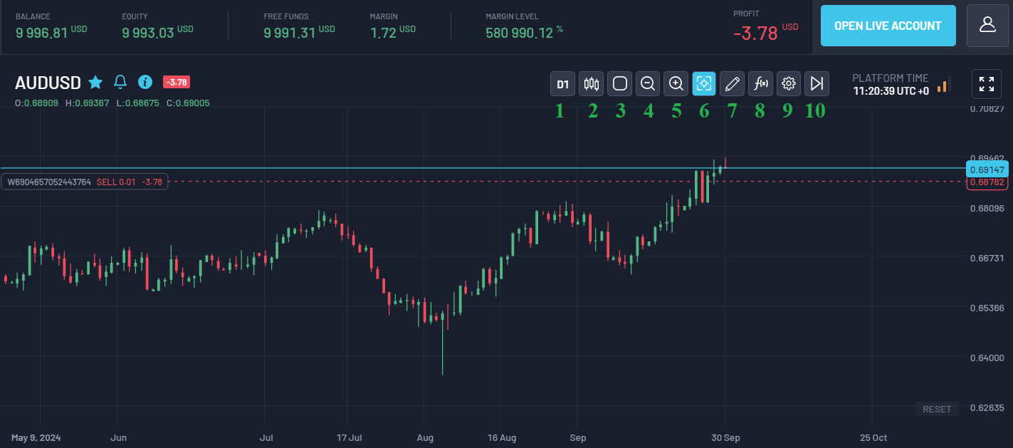
1. Let you to choose the timeframe of the candle and the chart (from 1 min to 1 month). Most often, traders use 4-hour and daily timeframes (when one candle = 4 hours or 1 day).
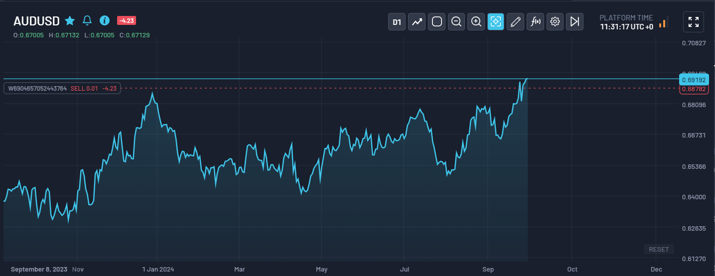
2. Let you to choose the type of chart: candlestick chart or zone (linear). You can see zone type on pic. below. However, the zone chart is usually harder to analyze for most traders and the candlestick chart itself is more popular as it provides more price information.
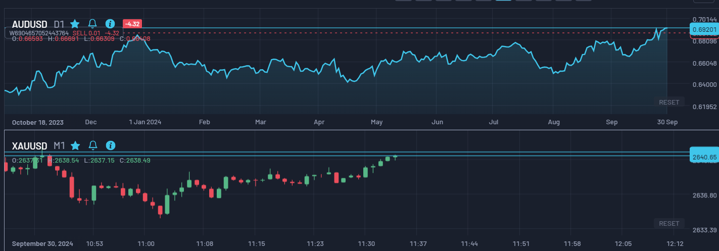
3. This feature helps you place multiple charts on your screen. This is convenient when you have several orders open and even the ability to watch them at the same time. On the pic below we can see 2 charts : zone type for AUDUSD and XAUUSD.
4-5. Allows you zoom chart.
6. Helps you to display the opening price, closing price, maximum and minimum prices next to the asset.
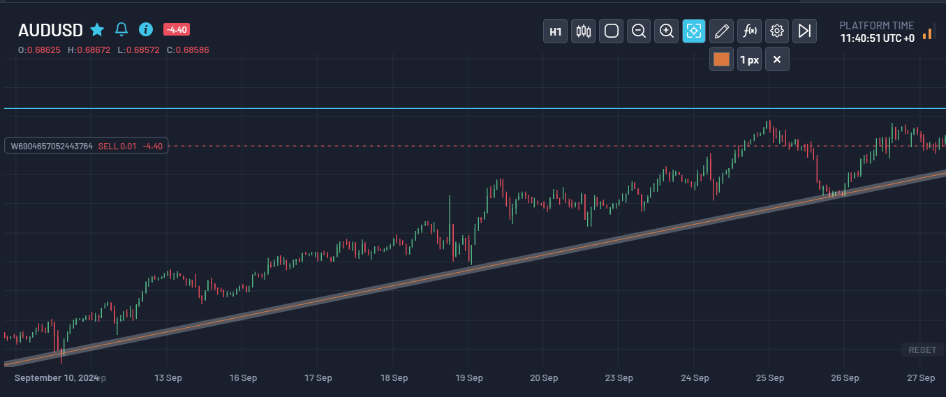
7. Let you to draw graphic objects on the chart (trend line, Fibonacci levels, vertical and horizontal lines, channel). For example, you can see trend line in the pic. below.
8. Technical indicators button for chart analysis. You can read more about what is it and how to use it here.
9. This function allows you to display a square grid on the chart and display or not open positions.
10. Allows you to return to the current chart if you have rewinded the history of the asset.
We wish you successful trading with ArtСap !